Harness the Power of Different Color Schemes for Your Stage Lighting
Lighting is a great way to transform a worship space. Churches across the U.S. are tasked with updating their lighting and video capabilities in order to create more engaging environments. As stage lighting and video equipment continue to become more cost-effective, we have more accessible tools than ever to help create dynamic spaces. Once you get all of these tools in place, it's critical to know how to use them to engage your audience. Learn more about how to use one of the most effective tools a lighting designer has, color.
Visual Matters
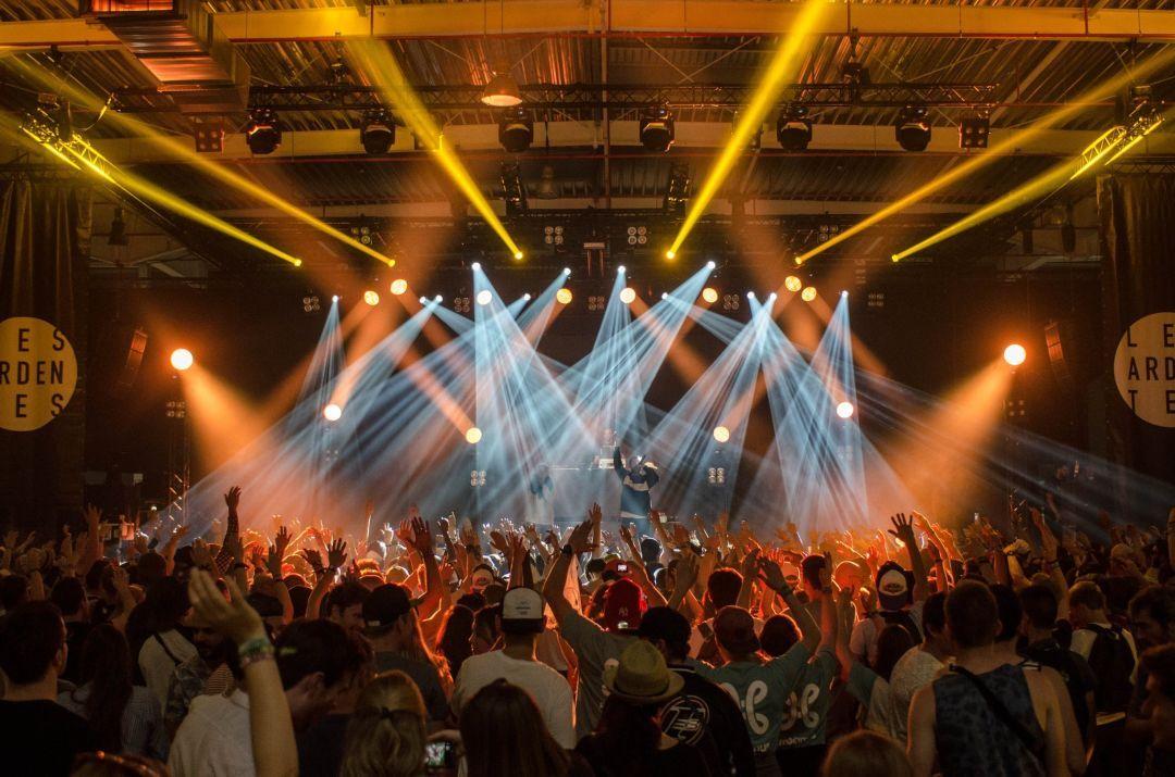
Our society has become obsessed with the visual. If you want proof of that, take a walk through Times Square and see how many images bombard people for attention. Or take a look at your favorite news channel and see how many streams of information they cram on one screen. We're so used to multiple streams of visual content that content alone won't even get our attention anymore. We expect visual content to evoke emotion and response, and when it doesn't, we tend to dismiss it as less important. This is the challenge that many of our churches face today. Churches with bland environments often find their people disinterested as their constant need for visual engagement is going unmet. We are not here to argue whether that is a good thing, but with the strategic use of lighting and graphics, we can create visually engaging spaces that intentionally help move people through the journey we create for them. One of the best ways to do that is by creating a mood effectively with colors.
Setting The Mood With Colors
It used to be musicians and preachers held autonomy when it came to setting the mood for a worship space. The tempo and arrangement of the music or the inflections and force of the person speaking were the key artistic elements used to establish the feel of the moment. In today's age, those elements are still important, but your lighting and graphic artists additionally have a great deal of responsibility in helping create the mood of an auditorium or stage. The colors you choose can and will invoke, at the very least, a subtle emotional response, so it's critical that your audio and visual art, work together to create a unified front in order to engage your audience. Let's take a look at what most people agree colors emotionally mean:
Red
Intense, Fire, Blood, War, Danger, Love, Passionate, Strong
Yellow
Sunshine, Joy, Cheerfulness, Energy, Intellect
Orange
Warmth, Stimulating, Enthusiasm, Happiness, Success, Creative, Autumn
Green
Nature, Growth, Fertility, Freshness, Healing, Money, Safety
Blue
Sky, Sea, Depth, Stability, Trust, Tranquil
Purple
Royalty, Power, Nobility, Wealth, Mysterious, Dignified
Visual artists that help create an engaging atmosphere will be intentional about their selection and choose a base color that enhances to the mood the team or artist is striving to produce. If your musicians are leading people in an up-tempo praise song, a base color of dark blue or purple can create a harsh contrast to the upbeat music with its more tranquil visual feel. Similarly, a slower song about the Lord's sacrificial death combined with bright yellow and orange lighting creates conflict as the music is somber and the visual conveys happiness and joy. Colors are a powerful player in setting the environment. Use them wisely and intentionally.
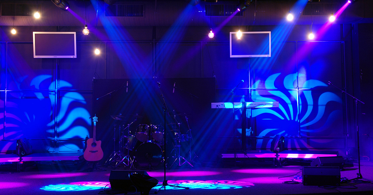
Start with Two Colors
While you need to be intentional and strategic about picking a base color to help set the mood of the environment, you should always light with more than one color. While lighting with a single color could be highly impactful in certain situations, it is best for lighting operators to shoot for two colors, and sometimes three. One of the most common mistakes lighting designers make is trying to do too much with what they have, bringing focus to the lighting instead of the environment it should be trying to create. Anytime there are more than four or five colors being used on a stage, it can create a distraction for the audience. If you're looking to create intentional, cohesive environments, use two to three appropriately matched colors to achieve your objective.
Monochromatic, Complementary and Analogous Colors
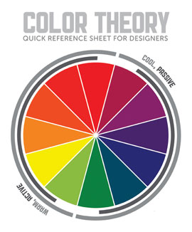
So what exactly does appropriately matched mean? When choosing two to three colors for a stage it is generally recommended (though not always) to use a monochromatic, complementary or analogous color scheme. The color wheel in the graphic to the side shows examples of different color schemes.
Monochromatic Color Schema
A monochromatic color scheme includes all variations of shading of one color. In the color wheel, you see purple being the main color but a variety of lighter and darker shades of purple being available. Lighting with a monochromatic color scheme focuses in on a particular feel for an environment and can be quite an effective way to set the mood.
Complementary Color Scheme
In the graphic, we see that complementary colors are colors that are opposite each other on the color wheel. In the color wheel, red is the complementary color to teal/blue. Complementary colors are great to use during mid-to-upbeat songs where the color contrast can be fun and add energy. Orange and blue are a great combination of complementary colors that when mixed together can create an exciting and engaging atmosphere.
Analogous Color Scheme
Analogous colors are your main color choice plus the colors to either side of your main color. In the color wheel, we see that orange, red/orange and red are analogous colors. Analogous colors such as purple and blue are great to use together during slower, more intimate music to create an environment that mixes feelings of nobility and tranquility. During songs that have a stronger intensity or battle cry, red and orange make a great combination.
Wrapping It Up
As with most art, lighting schemes talked about here are not hard and fast rules but a place to start. Aside from choosing between a monochromatic, complementary or an analogous color scheme, just remember to choose colors that will convey the emotion of the moment. As you gain experience and remain intentional, you'll get a feel, over time, about which color combinations work for which scenarios and will become quicker in matching colors to scenarios. As your ability to choose color develops, you may find that you have to navigate from these starting points. I tend to stick with the three main color concepts, but sometimes I like using a blue base color with yellow highlights during an up or mid-tempo song, or a mixture of red and purple during a majestic ballad, both creating engaging looks yet stretching the concept of analogous colors. At the end of the day what matters is that your audience engages with your performance, and whatever it takes to help that happen is worth it.